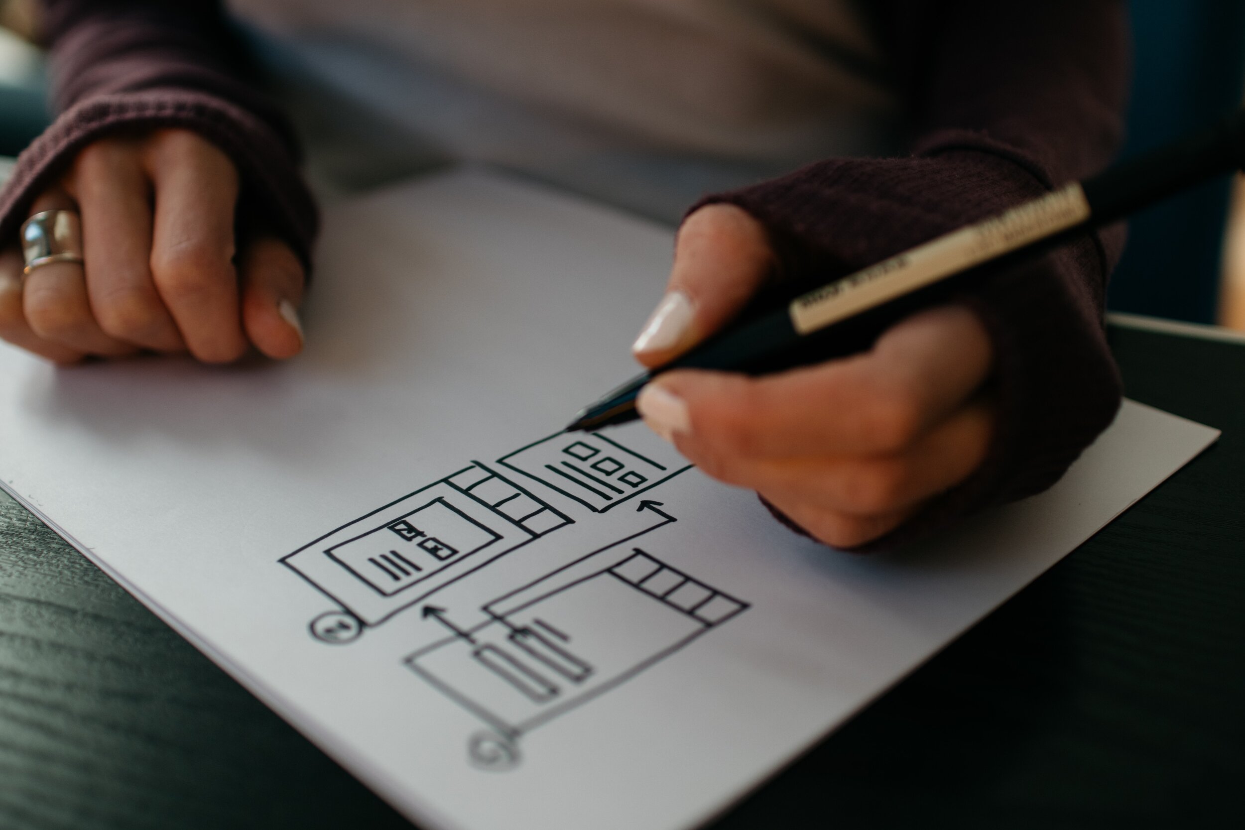
Creating an Enjoyable Mobile Ordering Experience
Flavor Faves Yogurt
Project at a glance
For my first UX project, I conducted guided storytelling sessions, created prototypes and did user testing before designing high-fidelity interactive prototypes for a mobile meal ordering tool.
Methods
Guided storytelling
User testing
Affinity diagramming
Tools
Pen and paper
Sketch
Axure
Concept Overview
Flavor Flaves, a (fictional) frozen yogurt company, was developing a new online ordering process. The website needed to maintain the playful and fun aesthetic of the shop while creating the convenience of online ordering. The goal was to create an enjoyable meal-building interface that felt similar to the in-person ordering experience so that a family could customize their meals and save them for future orders.
Research
I began my research through guided storytelling in order to gain insight to help create a more meaningful experience with food ordering systems. I interviewed three users about memorable experiences that they had with mobile restaurant ordering sites. These conversations revealed that users desired an ordering process that allowed for meal customization, with the additional ability to save those customized favorites for future orders. Users also said that they preferred to use restaurant sites where the aesthetic and flow of the website mirrored that of the physical restaurant.
“We have a big family and it takes forever for each of us to customize our orders every time we want to get food from here. I wish there were a way for us to reorder the same things we each got last time.”
— User group interview
Design
Using this information, I sketched low-fidelity wireframes to create a website preserving the integral enjoyment of customizing a yogurt bowl in person with a process that felt similar to the experience of adding custom toppings to yogurt in a shop. Users can swipe horizontally from station to station to select flavors and toppings, just as they would move along the counter in a brick-and-mortar shop. Pages were also designed to allow users to reorder from their past purchases and save items to a favorites page with custom names and profiles.
I then used Sketch to design user flow and site architecture to outline a “happy path” for order creation. Static wireframes were then converted into interactive prototypes in Axure to show the interactions and mapping of the pages.
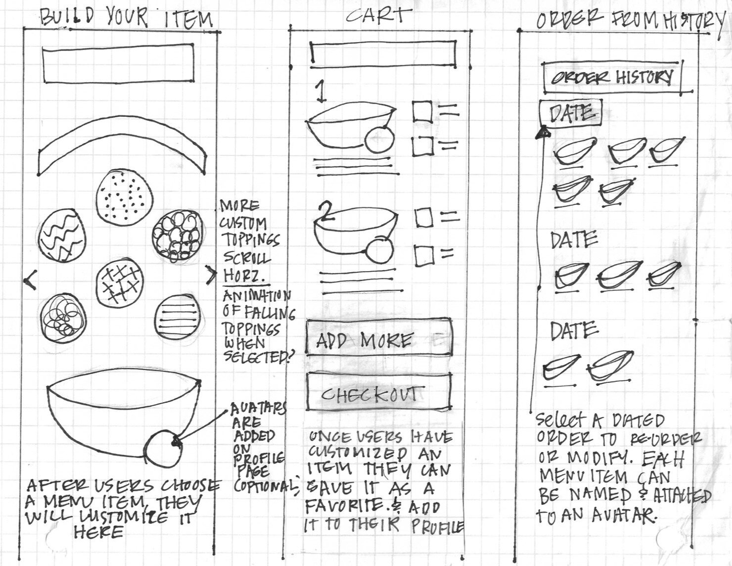
Initial low-fidelity wireframe sketches
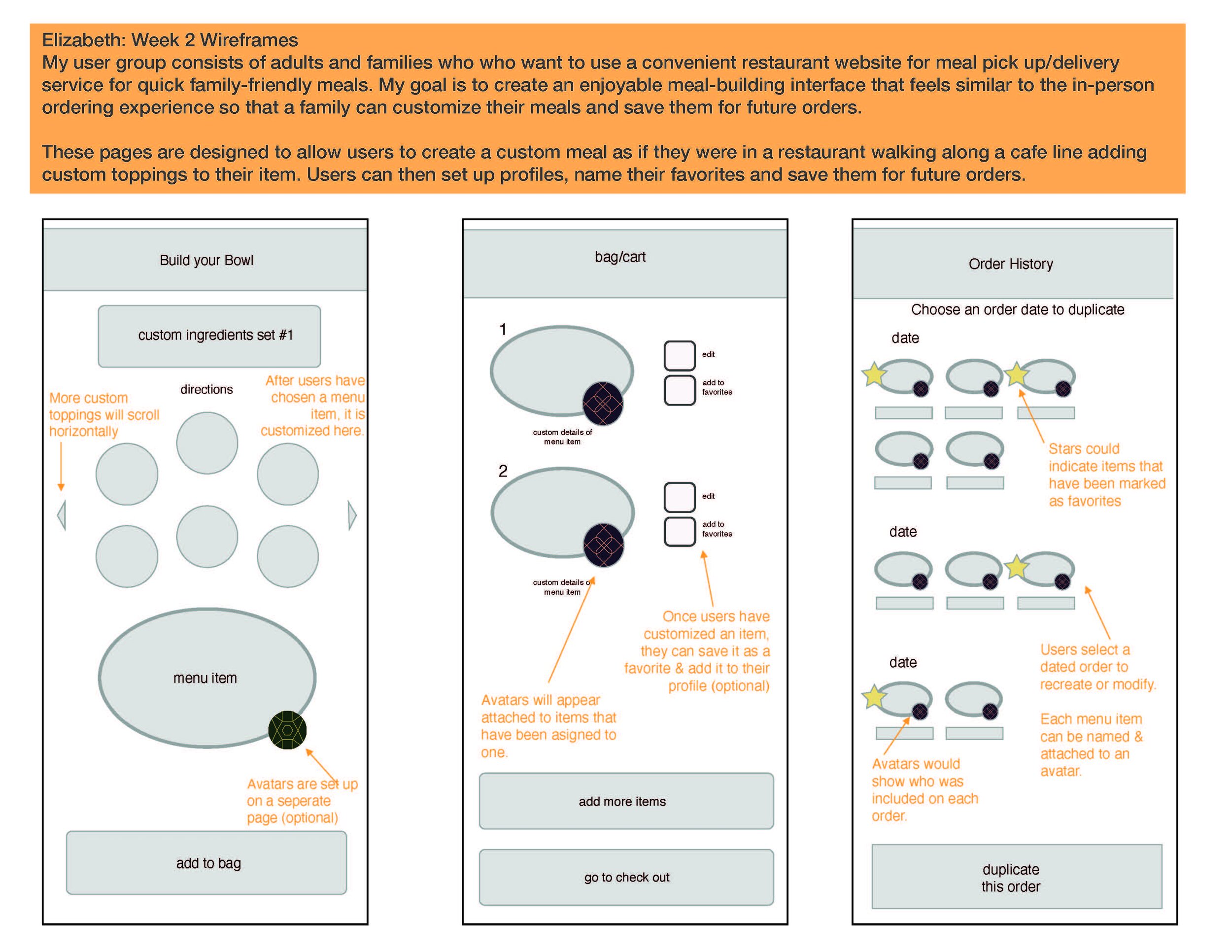
Annotated wireframes in Sketch
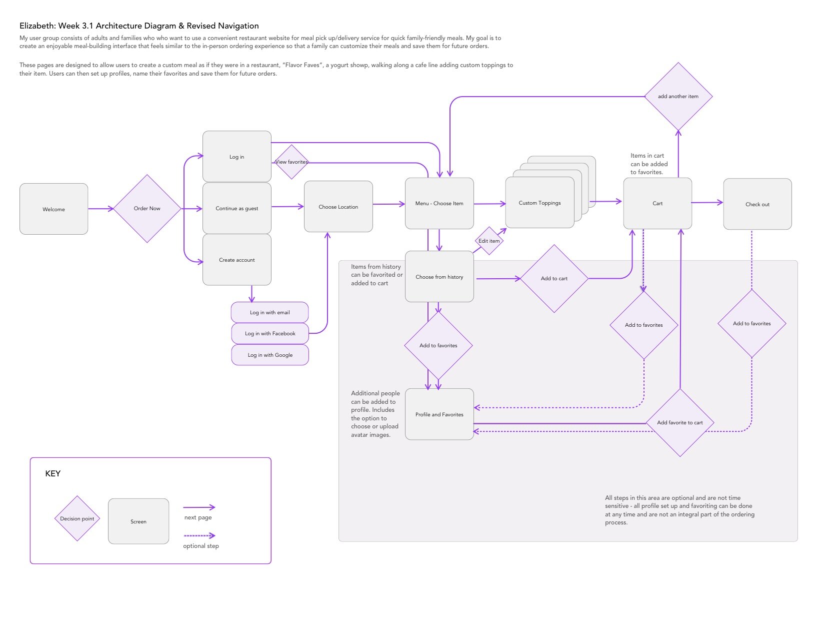
Architecture diagram
Testing
Next, I performed user tests to evaluate the product concept and gain insights into the experiential quality of the site with the target audience, to evaluate the usability of the key task flows and reveal friction points and confusing experiences. Testing was completed with four subjects who enjoy going to (in-person) frozen yogurt shops. I conducted tests both in person and remotely. Users were given three tasks to complete on the site and encouraged to complete them independently, while thinking aloud and narrating their thoughts and decisions throughout the steps.
After testing was completed, I sorted user comments into themes with affinity diagramming. These themes included overall concept and usability. Within usability, comments were further divided into navigation, hierarchy, and consistency, as most issues fell within these three categories. The overall concept and experience received positive feedback from users.
While all users were able to complete the assigned tasks, some problems were found with consistency, navigation and hierarchy. Markups were then created to revise the current prototypes for further testing.
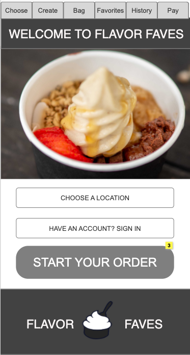
The homepage has clear navigation allowing users to create a new order or navigate directly to history or favorites pages.
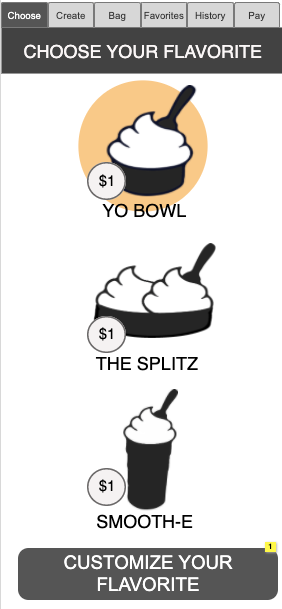
Users choose which item from the menu they would like and then proceed to customize it on the following page.
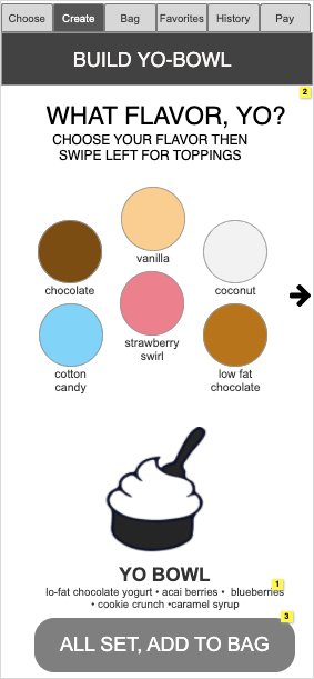
Users create their custom yogurt creations here by clicking to choose their flavor choices and then swiping left for additional toppings.
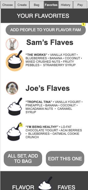
The Favorites page shows members of a user's "Flavor Fam" and allows them to set up new profiles and assign avatars.
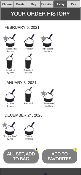
The History page displays a users order history with indication of which items are saved favorites and allows them to reorder directly from this page or add items to favorites.
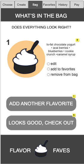
The shopping bag shows items that have been chosen and customized and allows users to either edit them or save them directly to their favorites.
Interact with prototypes here.
Project Outcomes
A convenient and pleasing ordering solution was created that maintains the playful and trendy aesthetic of the company. The novelty of the site makes it attractive to new customers and the ability to name and save their favorites encourages customer loyalty.
“It’s very convenient, and I think it would be fun to
name and save my favorites. ”
— User test subject

