
Optimizing a non-profit’s message
MN SNAP Site Audit
Project at a glance
MN SNAP wanted a review of their site before they started a redesign. I did a heuristic analysis and user testing before suggesting potential changes to their site navigation and text hierarchy.
Methods
Heuristic analysis
User testing
Prototyping
Tools
Google sheets and slides
Invision
Zoom
Trello
Sketch
Concept Overview
Minnesota Spay Neuter Assistance Program (MN SNAP) is a Minneapolis community non-profit with a strong, clear mission. Their goal is to end the suffering and death of Minnesota cats and dogs due to overpopulation by providing high-quality, affordable and accessible spay and neuter services to those in need, and animal welfare education in the communities they serve.
MN SNAP offers spay and neuter services for family pets at a fraction - about 15% - of the average veterinarian office to families in need in Minnesota, as well as to feral, free-roaming and barn cats. They are able to provide these services to low-income families through donations from their generous network, fundraising events, and partnering with other local pet-focused organizations.
To strengthen its current capabilities, MN SNAP is about to undergo a website redesign initiative, in order to refresh its content, update its look and feel, and improve its overall user experience. It’s looking for insights on things that were working well on the current site as well as ways in which it can strengthen its donor user experience to ensure that it is supportive and seamless.
Testing Protocol
I conducted an initial Heuristic Usability Review of MNSNAP.org to identify possible issues with the site before testing. While the website was found to be informative and engaging with valuable information about the benefits of spaying and neutering pets, for both owners’ and pets’ quality of life, there were opportunities to consolidate information into clearer and more logical navigation paths, and to leverage textual hierarchy to highlight important data points throughout the site.
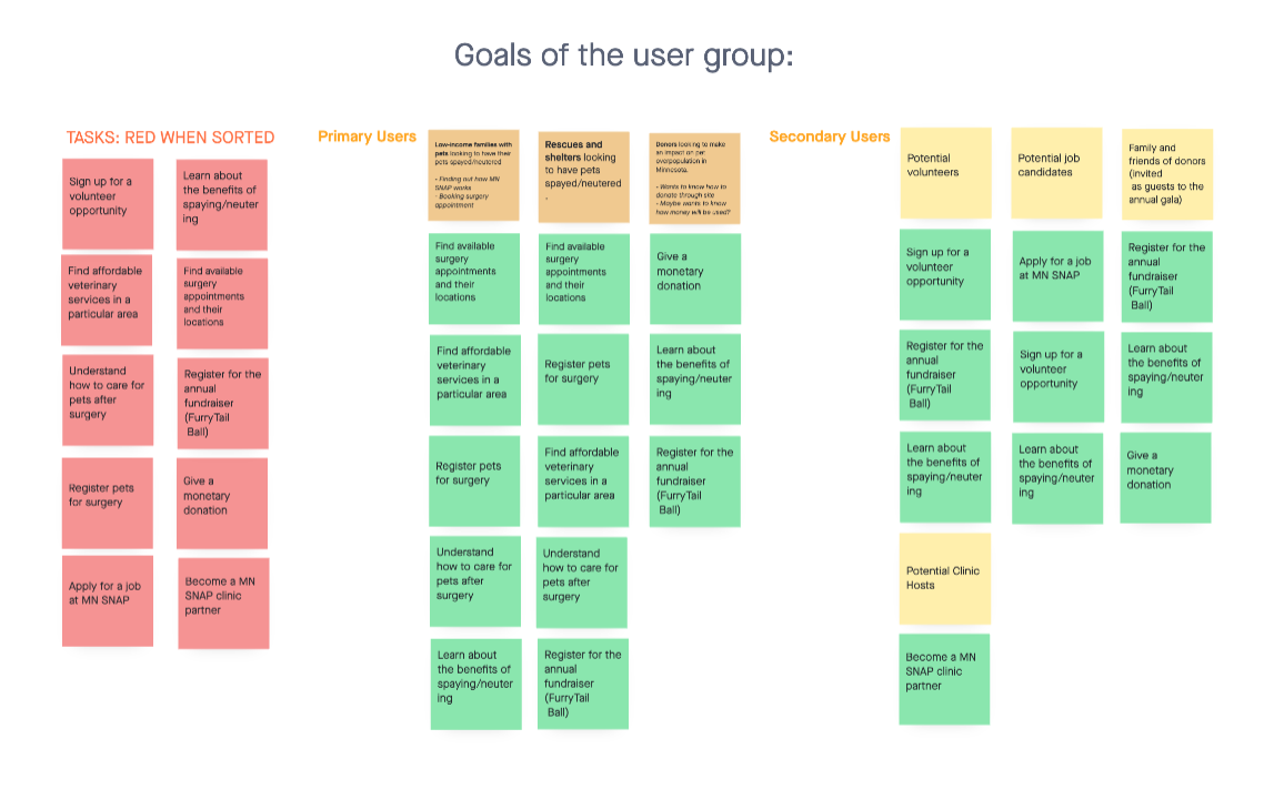
Project planning
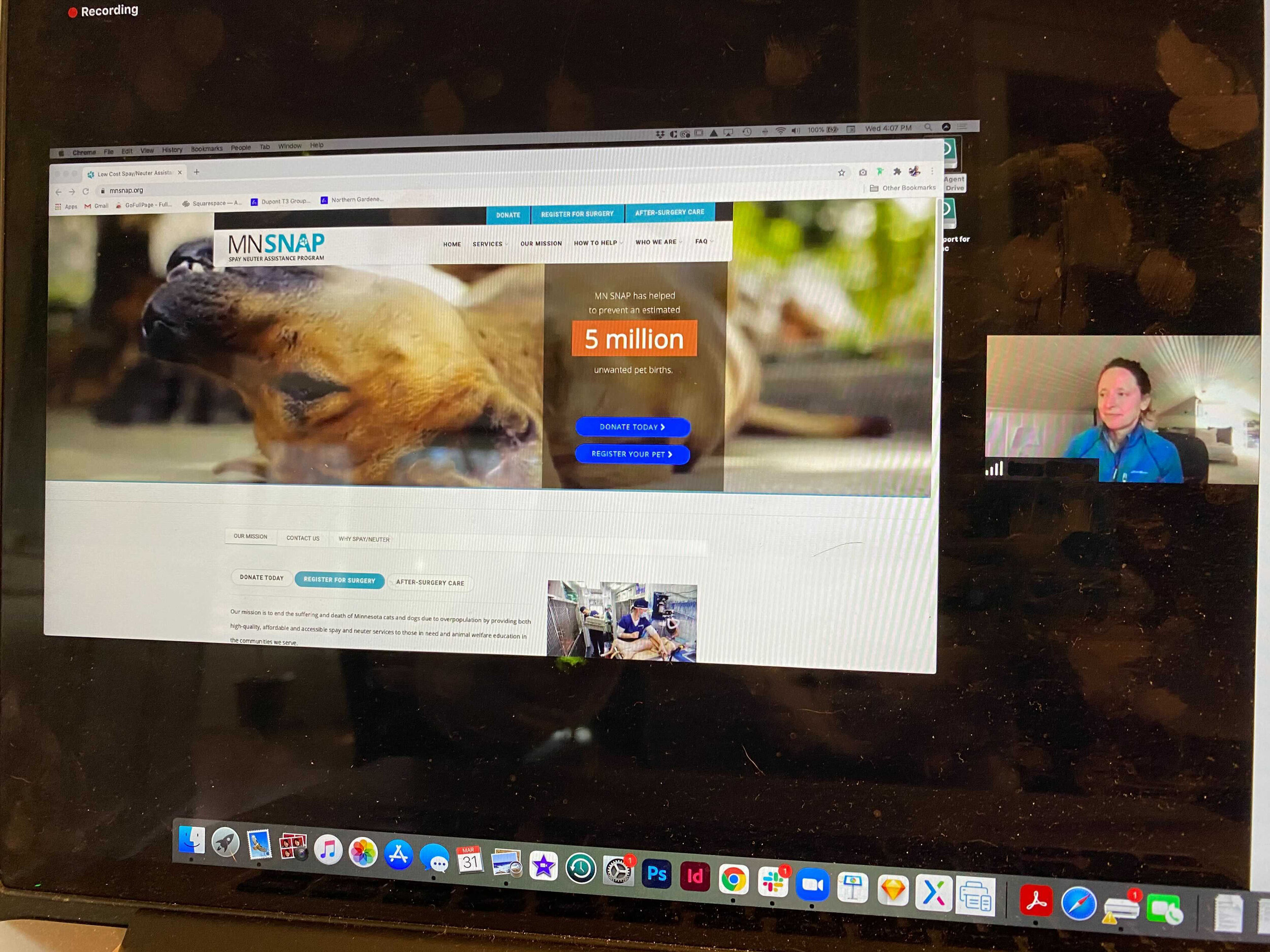
Remote user testing

Test script
Testing Goals
Evaluate the website’s clarity of purpose
Discover how the current site navigation and wayfinding impacts user screenflow for:
Users attempting to find and book surgery appointments and access aftercare information
Donors and volunteers interested in learning about ways to support MN SNAP
Identify and assess potential blocks to donors' ability to complete a successful donation
My team and I set forth two distinct scenarios to assess usability of the site. The first scenario was designed to determine the ease with which a user could determine whether they fit the financial qualifications to obtain services from MN SNAP, how much it would cost, and schedule an appointment.
The second scenario goal was to allow a potential donor or volunteer to learn more about the organization and determine the best way to support them, accessing pages for financial donations and volunteer opportunities.
Based on findings from the initial usability review, we conducted remote, moderated usability sessions using think-aloud methodology with 14 participants. We developed a script including the two scenarios above as well as general questions about users’ overall impression of the aesthetics and usability of the site.
“I was surprised, even as a pet owner who has had his cat spayed,
by the quality of life benefits!”
— User test participant
Test Results
Once user testing was completed, raw data from users was gathered and coded by sentiment, task, and site goal to identify trends and evaluate site ease of use.
Testing revealed that while most users were charmed by the pictures and videos of animals on the site and were able, for the most part, to complete the tasks assigned, there were in fact issues with finding complete information easily.
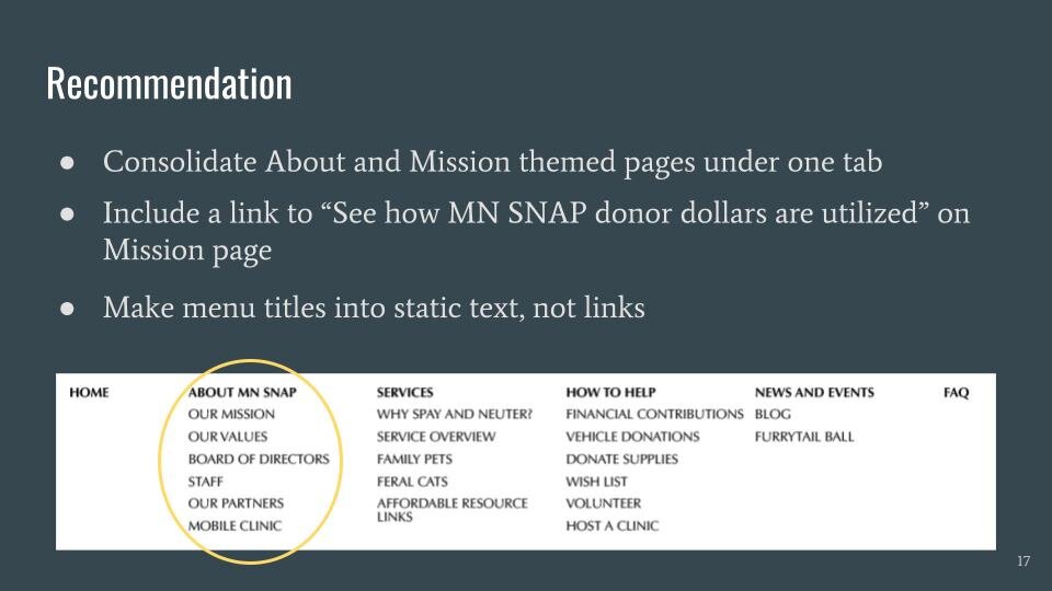
Users struggled with navigating the dropdown menus because many of them hovered over the menu title without clicking on it. Valuable information is housed on those parent pages that was largely missed by testing participants
Users either scanned through multiple dropdown menus to get a complete picture of MN SNAP, their mission and values, or only looked in one place, and missed information
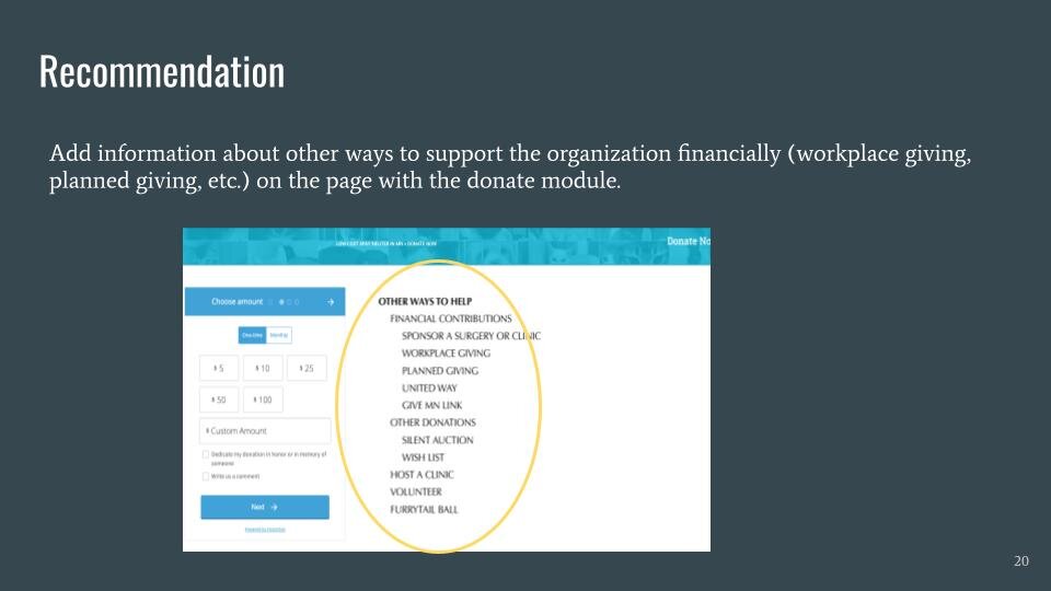
While a prominent Donate button at the top of the page was highly visible and the donate module linked to it worked smoothly, MN SNAP offers several other ways to support the organization that users were not seeing
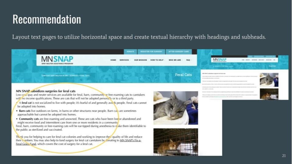
Over half of the users commented that the font size used on text pages of the site was too small and hard to read
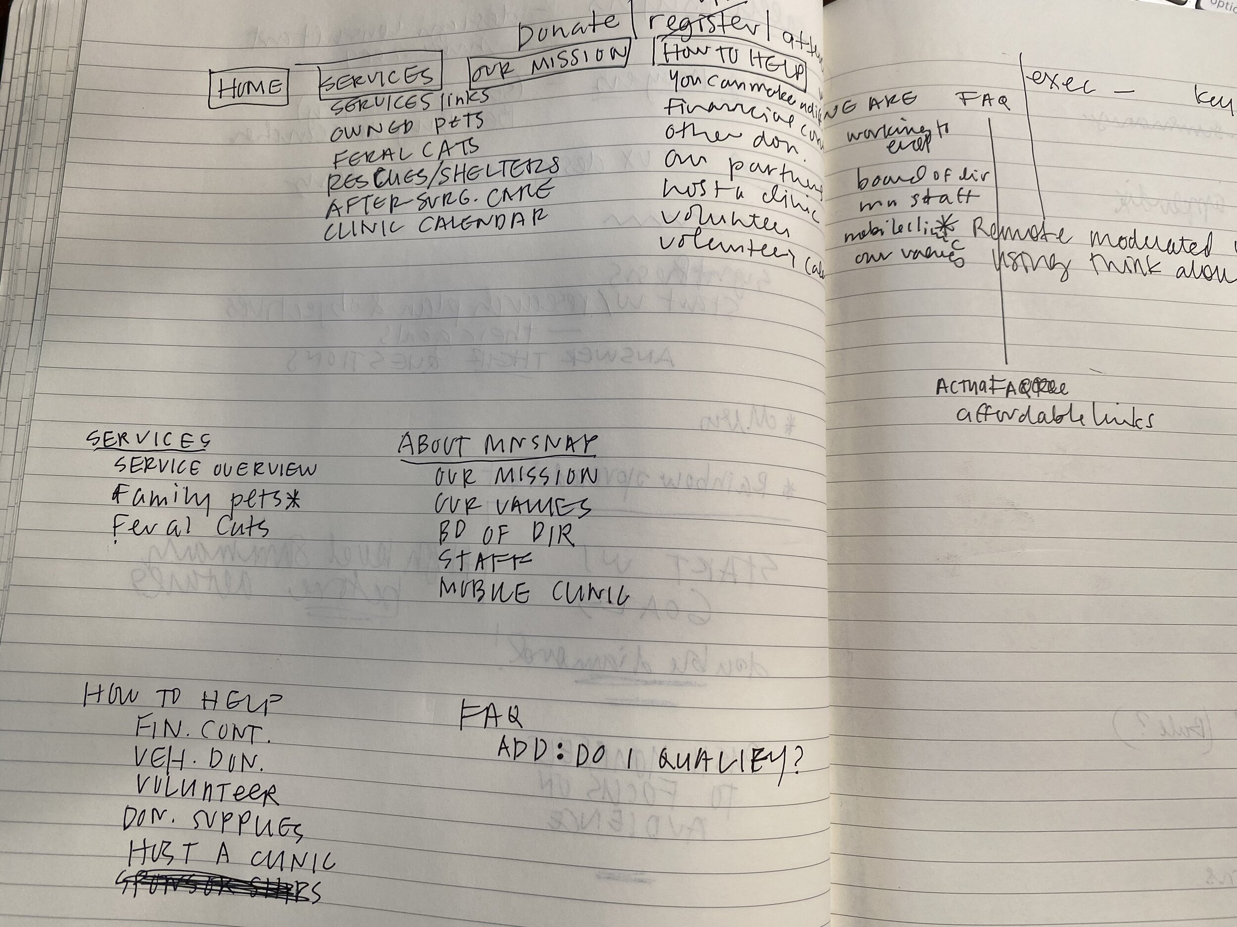
Developing prototypes
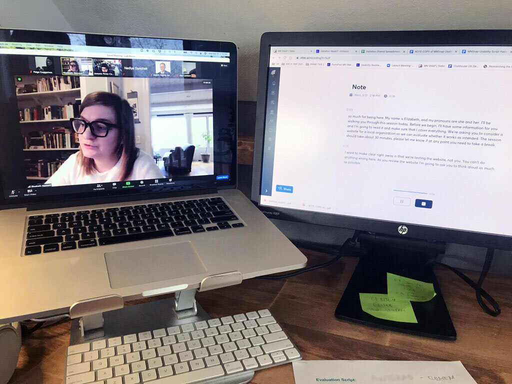
Conducting a remote test
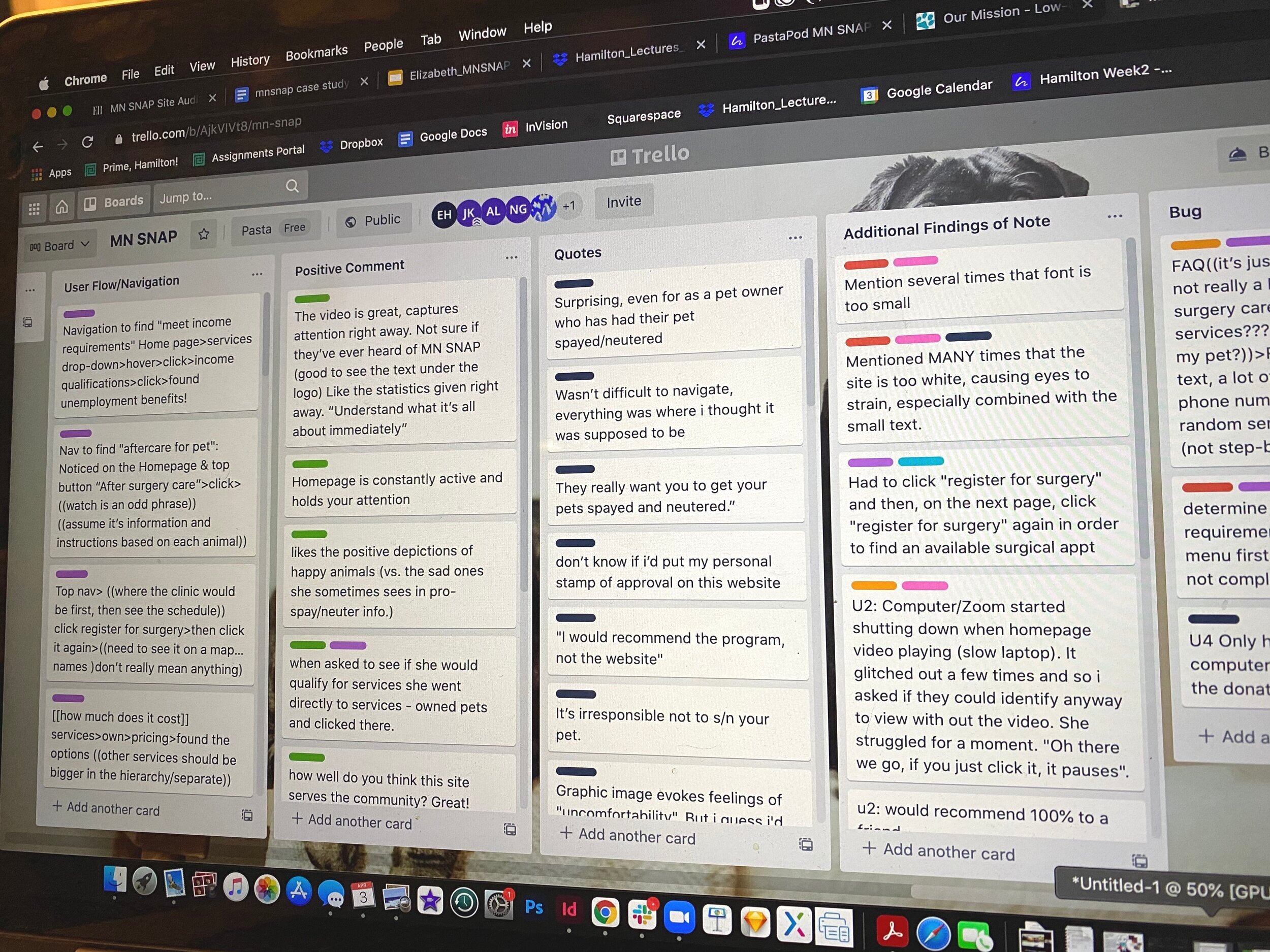
Sorting raw data
Findings and Recommendations
Finally, I prepared a findings and recommendations report with this information to inform MN SNAP of the user testing results. View the full Findings and Recommendation Report here.
Key Recommendations
Reorganize navigation throughout pages creating a clear hierarchy of information and consolidating all like content under common tabs
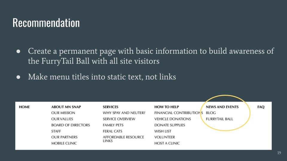
Create a permanent landing page for the annual fundraising event, FurryTail Ball, to raise awareness throughout the year
Lay out text pages to utilize horizontal space and create textual hierarchy with headers and subheaders
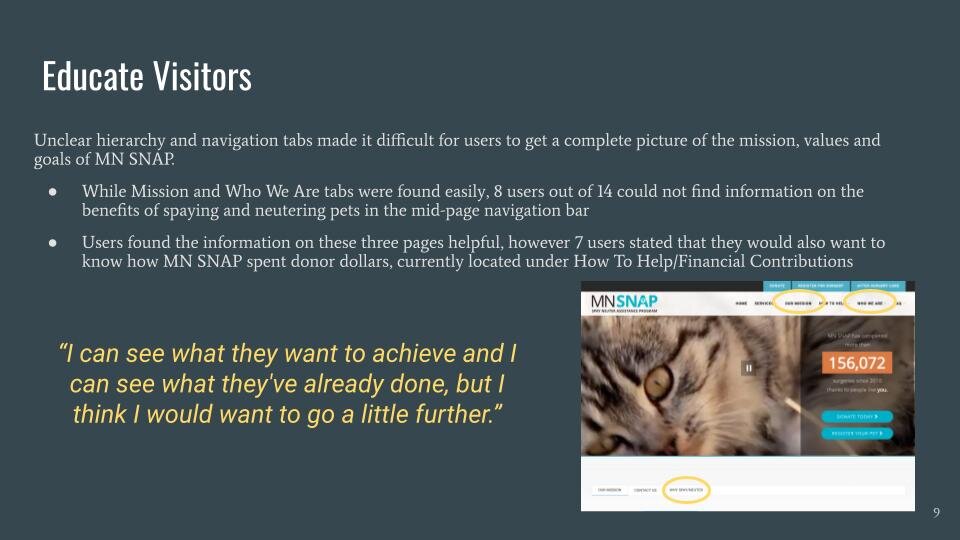
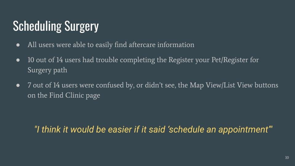
Project Outcome
Through analysis, testing and data synthesis, I was able to recommend easy-to-implement changes to the MN SNAP website to ensure visitors are easily finding the information needed to utilize the site and support a worthy community resource to improve the lives of their pets and the wider pet population as a whole.
“When I’m deciding who to donate money to I look at where the money goes, the reputation of the organization, their use of resources and their active involvement in the community.
— User test participant

