
Adding features to a financial platform application
Finotta
Project at a glance
Finotta is a financial application in development that is intended to be marketed as a white label product to banks and credit unions to help their clients understand and optimize their finances. I used stakeholder interviews and a competitive audit to create a customer journey map. I then sketched ideas that would be surveyed for a Kano Analysis before designing suggested additions to the app within the constraints of the client’s development budget.
Methods
Stakeholder interview
Competitor audit
Journey map
Feature cards
Dot voting
User survey
Kano analysis
Tools
Zoom
Pen and ink
InDesign
InVision
Google forms and sheets
Sketch
Concept Overview
Finotta is a mobile app platform centered around helping everyday people afford the things they need and want, and seeks to further them along on their financial journey. Finotta achieves this by equipping individuals with information about their financial health and incentivizing and encouraging them to improve it through incremental, actionable steps.
Finotta’s personalization APIs are leveraged in a financial journey-building approach for their customers’ end-users. Banks and credit unions are able to offer this application to their customers. Customers are able to link all their monetary accounts and determine a path towards paying off debt, building savings, and accumulating financial wealth.
Primary Users(App): Individuals who want a personalized digital banking experience to better understand and achieve their financial goals.
Secondary Users (Admin/Bank Dashboard): Credit unions and banks looking to grow engagement with customers and provide quality, cost-efficient financial tools.
Goals
Increase engagement during onboarding
Advance gamification concepts for incentivizing financial behavior change
Leverage micro-interactions for encouragement and support of behavior
Research and Methods
A stakeholder interview was held to better understand the goals, processes and limitations of the app.
My team and I conducted a competitor audit to examine the marketplace. Similar applications such as Mint, Credit Karma, MX Technologies, Personetics and YNAB were examined.
I created this Journey Map of what was understood of the timeline of a user’s interaction with the app. A better understanding of the needs, pain points and opportunities was gained.
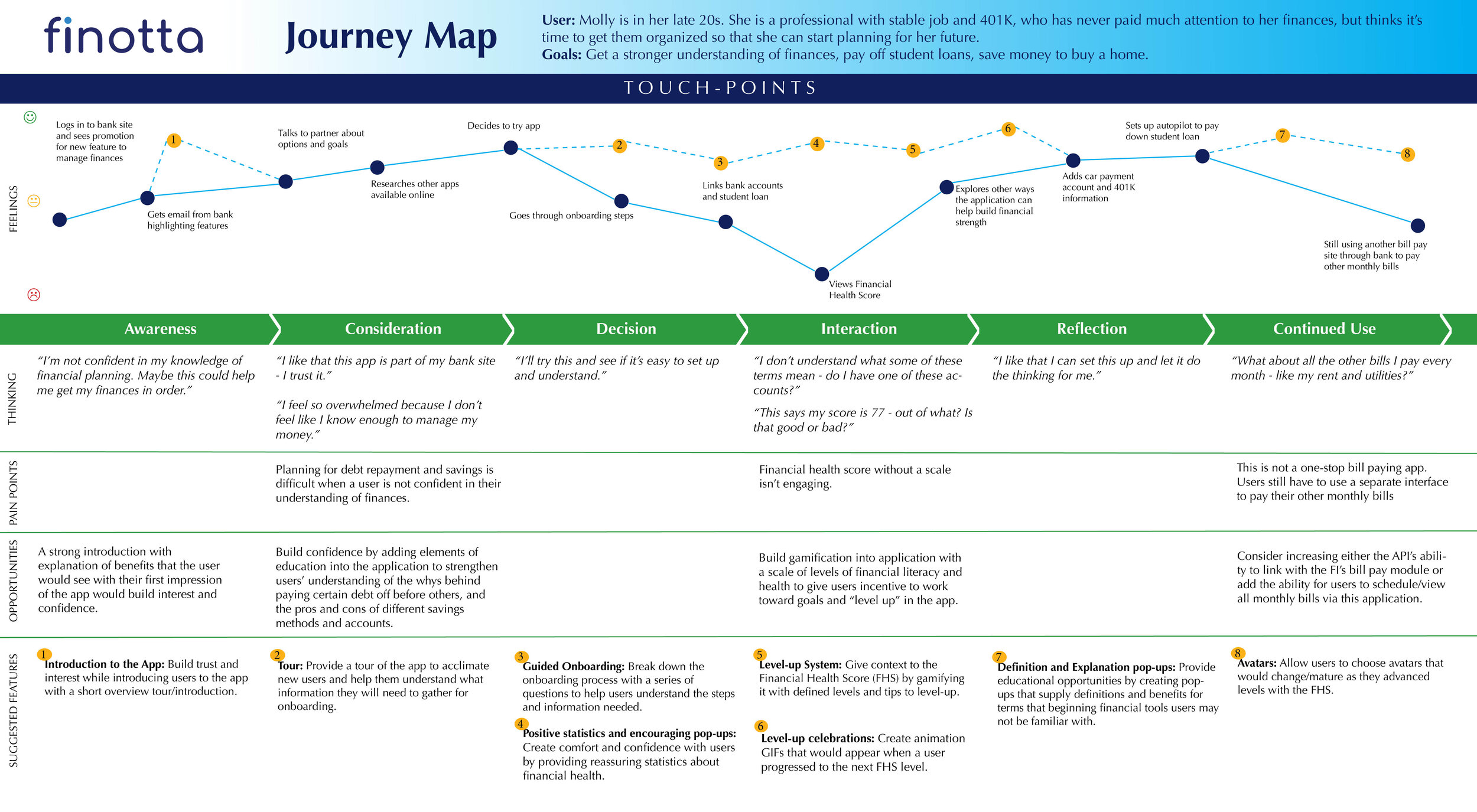
Finotta User Journey Map
Research and Methods
Feature Cards were produced by the team to illustrate potential gaps in the user experience and shared with the Finotta development lead to gain further understanding of the scope and possible time investment of each feature.
Dot voting was used to determine the which features should be included in a user survey.
Current Finotta users were surveyed for their perceived value of potential features. These responses were entered into a Kano Analysis model to rank them by expectation, performance and delight.
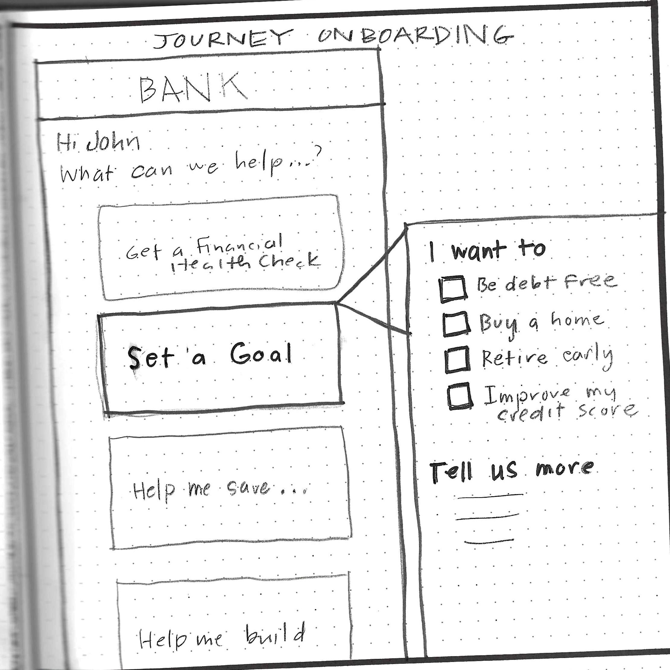
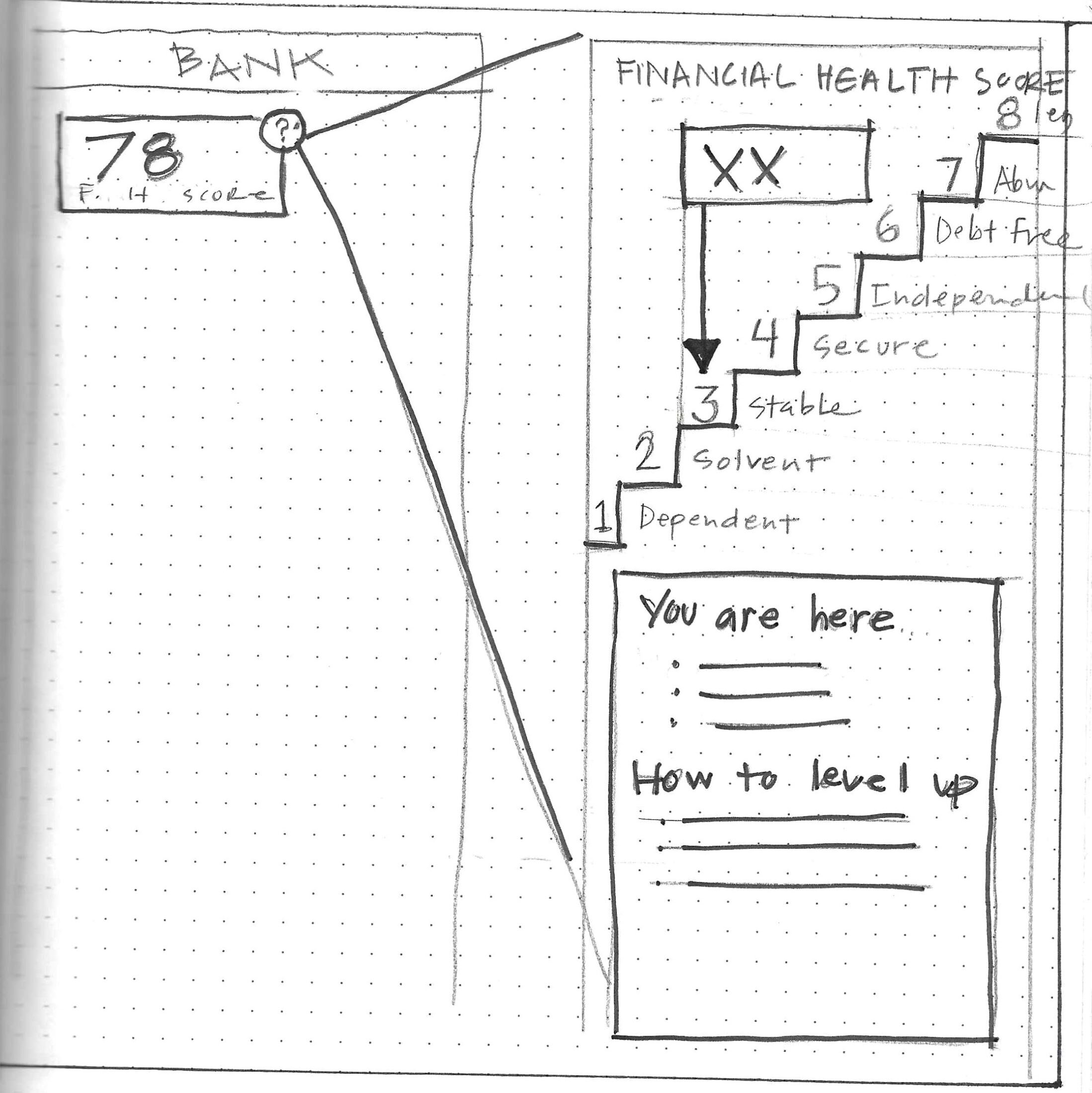
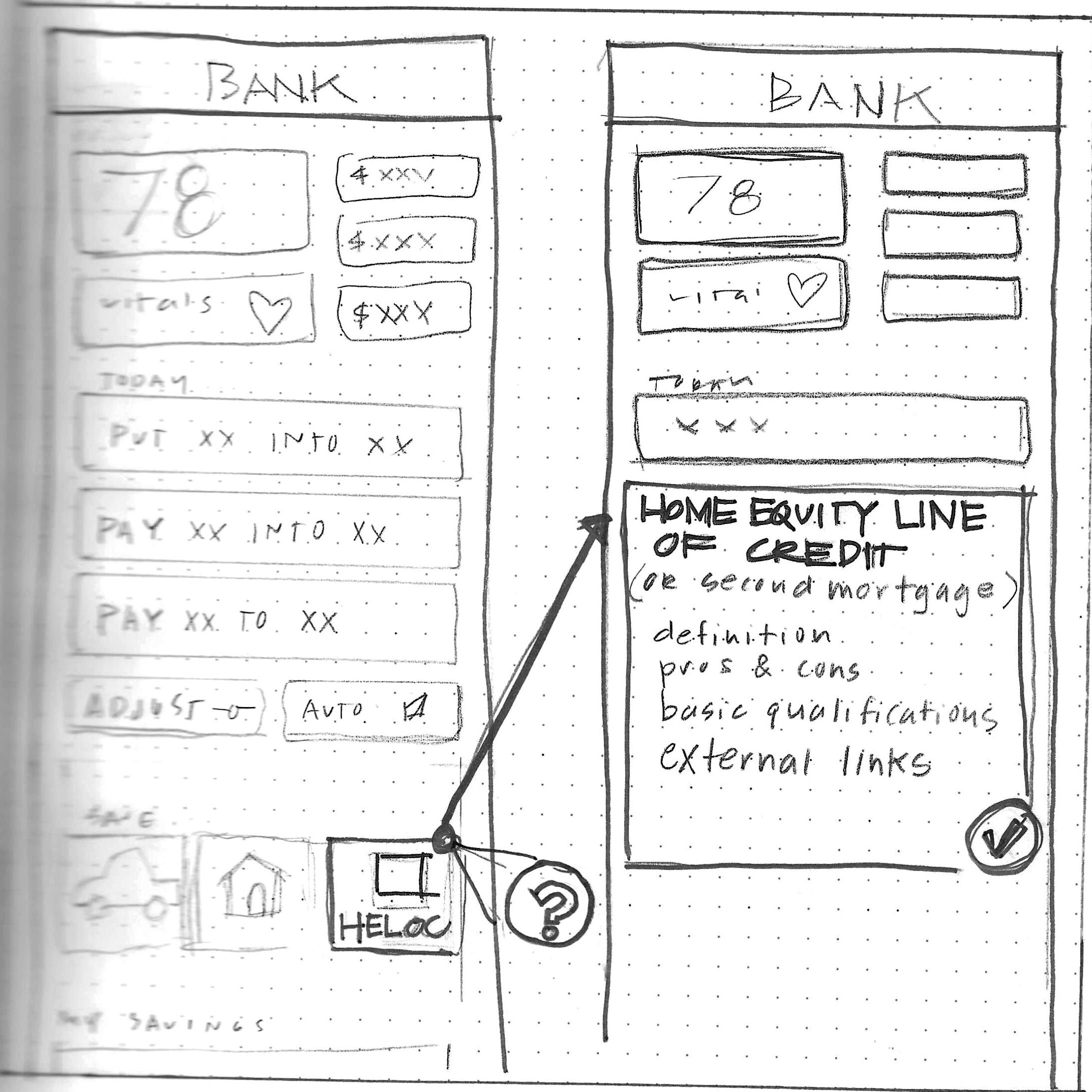

Findings
To gain a better understanding of how users would react to these new features, a survey was created to conduct a Kano analysis. Sketched features with descriptions were reviewed by current users of the app. They reflected on their feelings if each feature did or did not exist, and the importance level of each one. As expected, the highest rated features were those centered around gamification, followed closely by increasing engagement during onboarding.
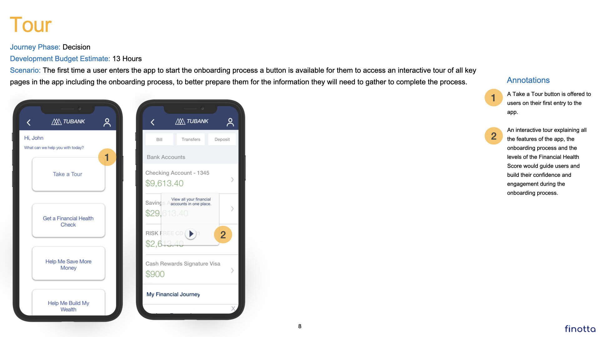
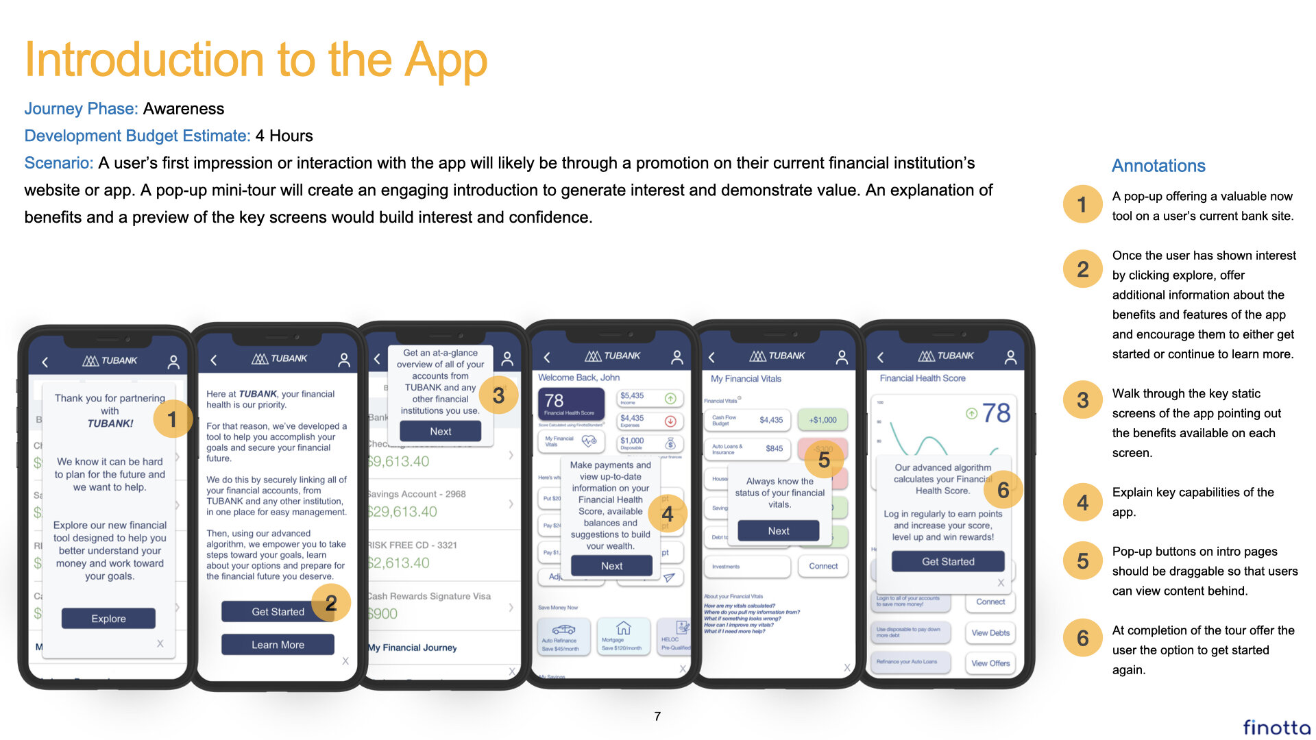
Recommendation with Journey Map and Annotated Wireframes
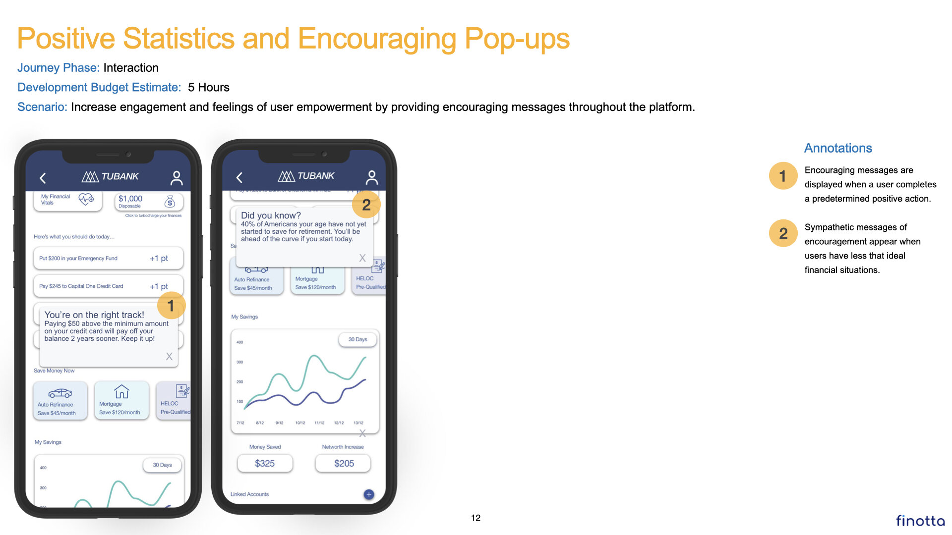
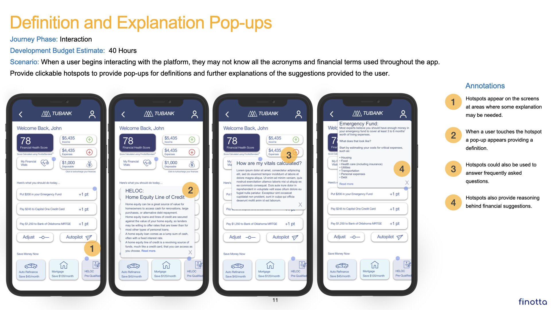
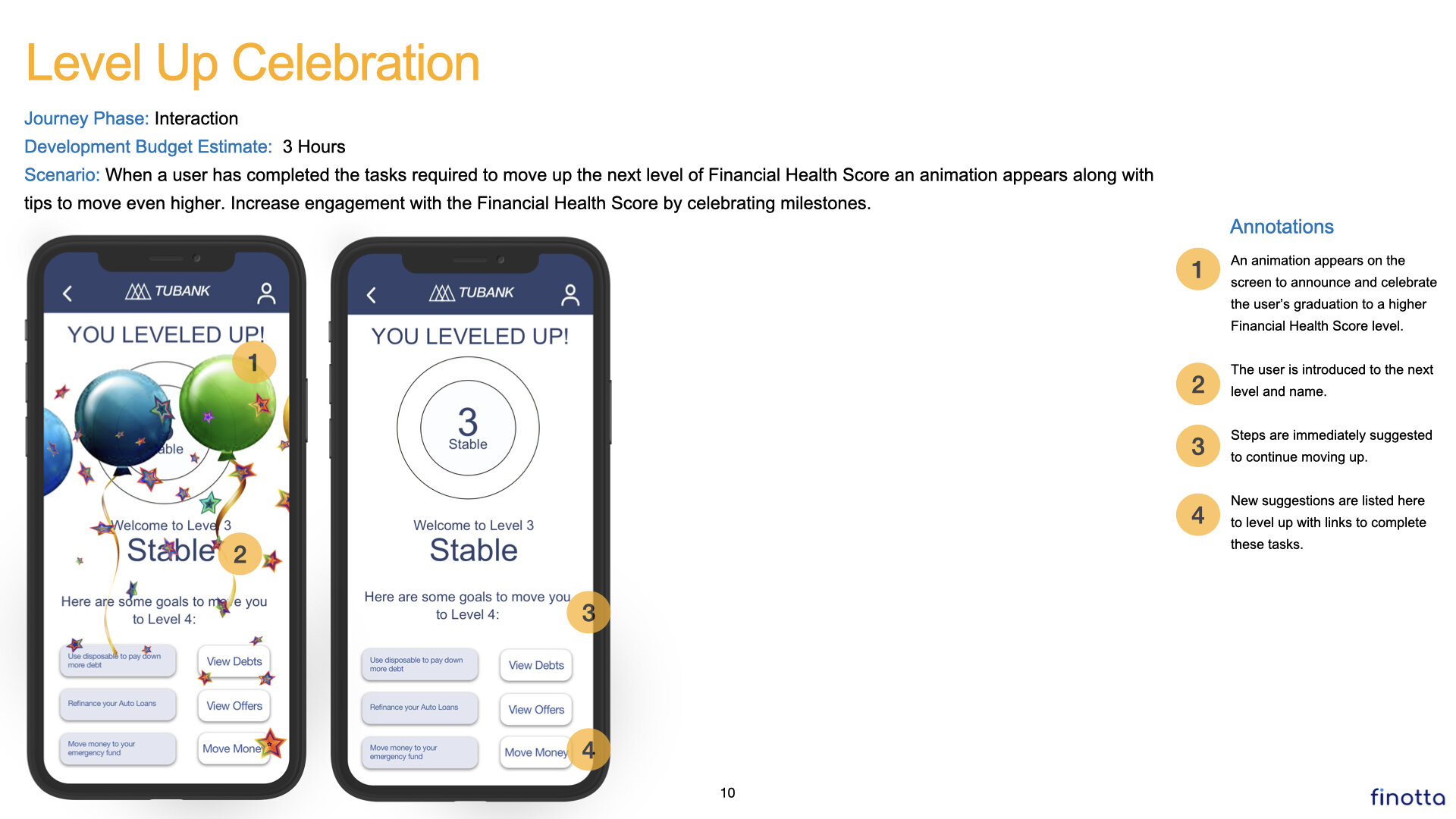
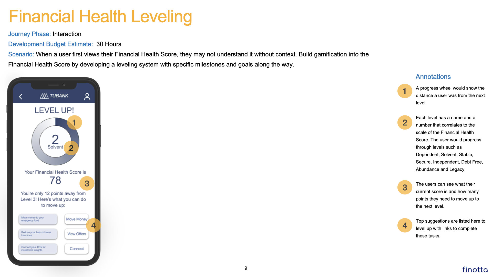
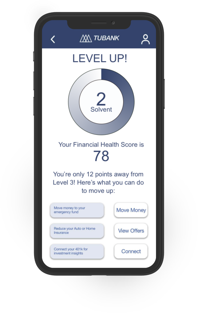
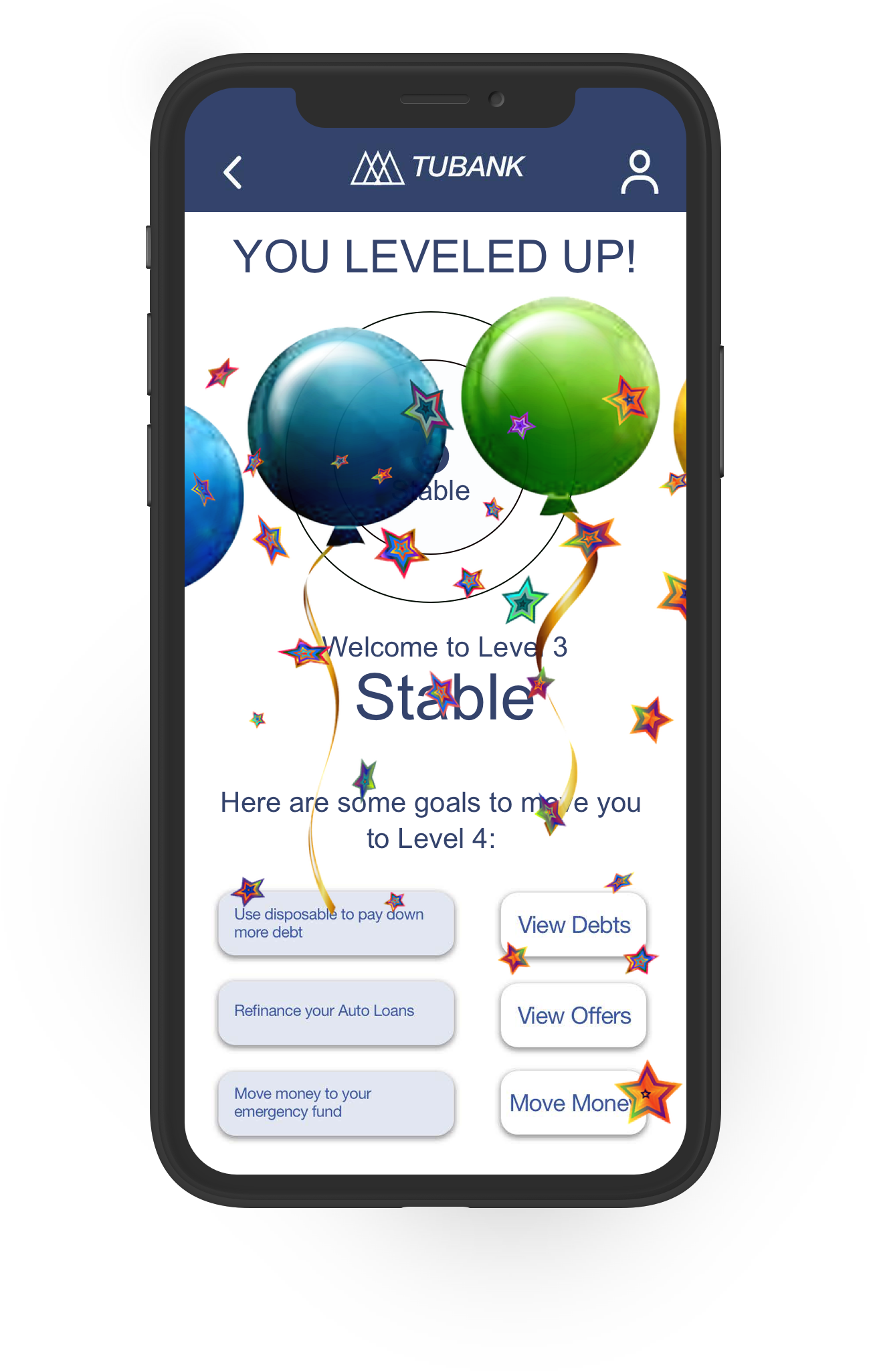
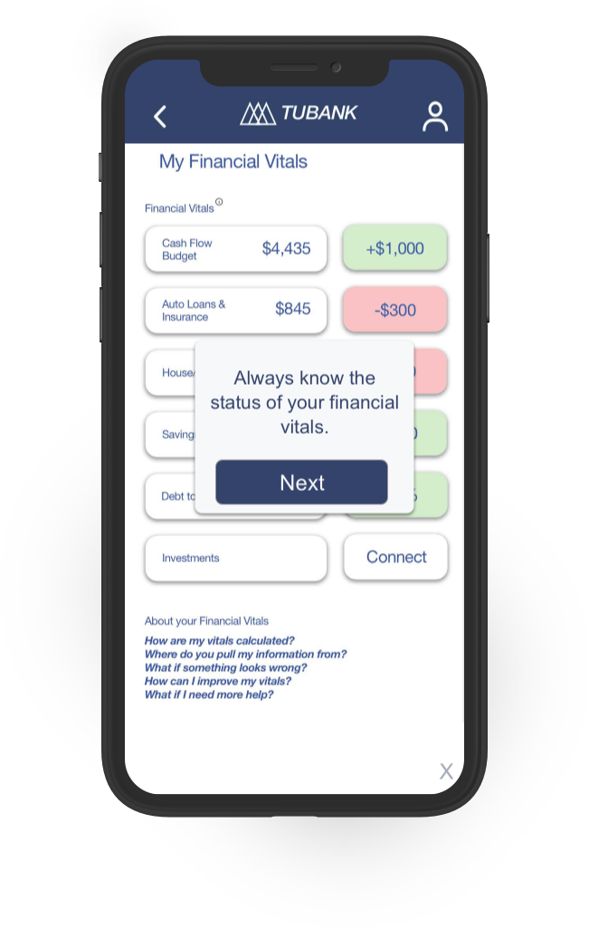
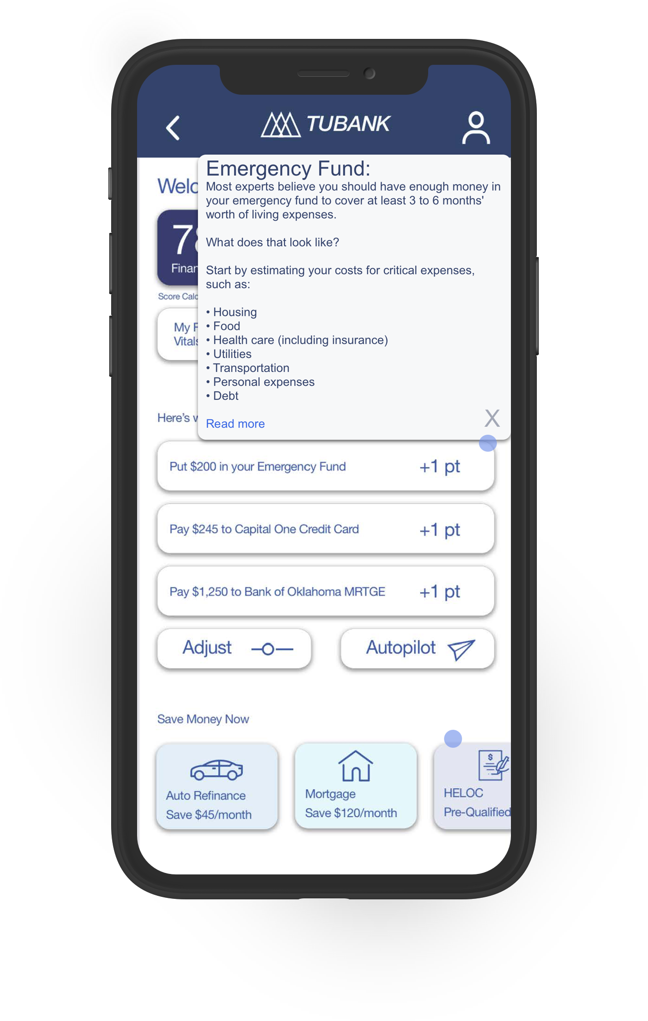
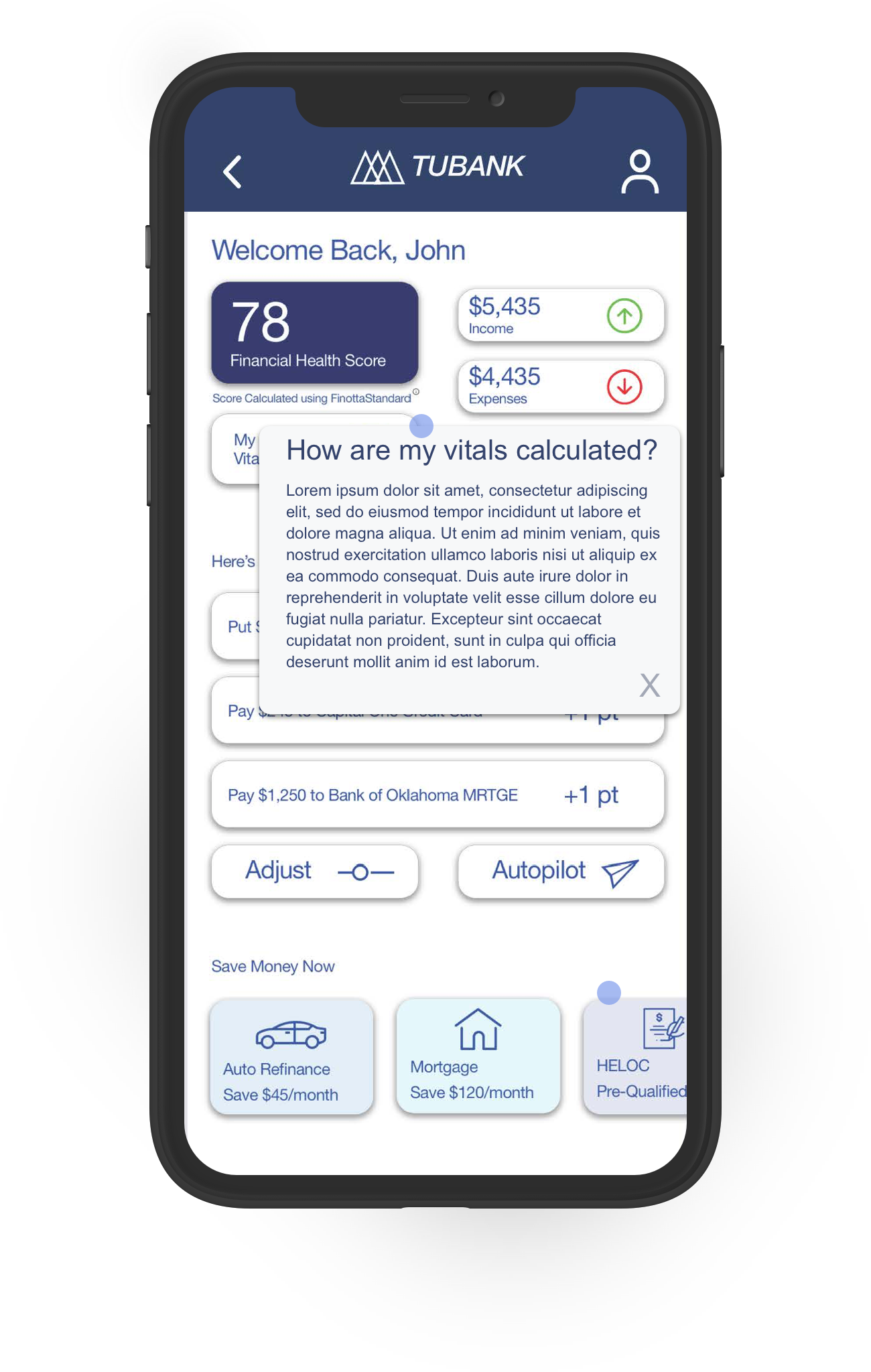
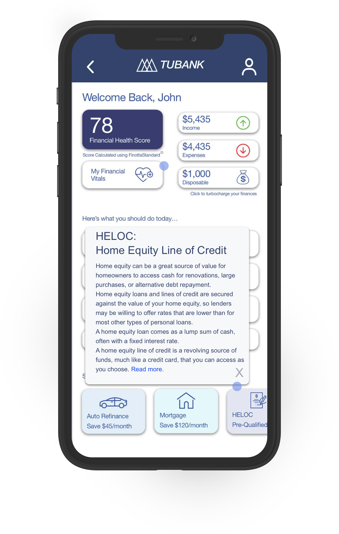
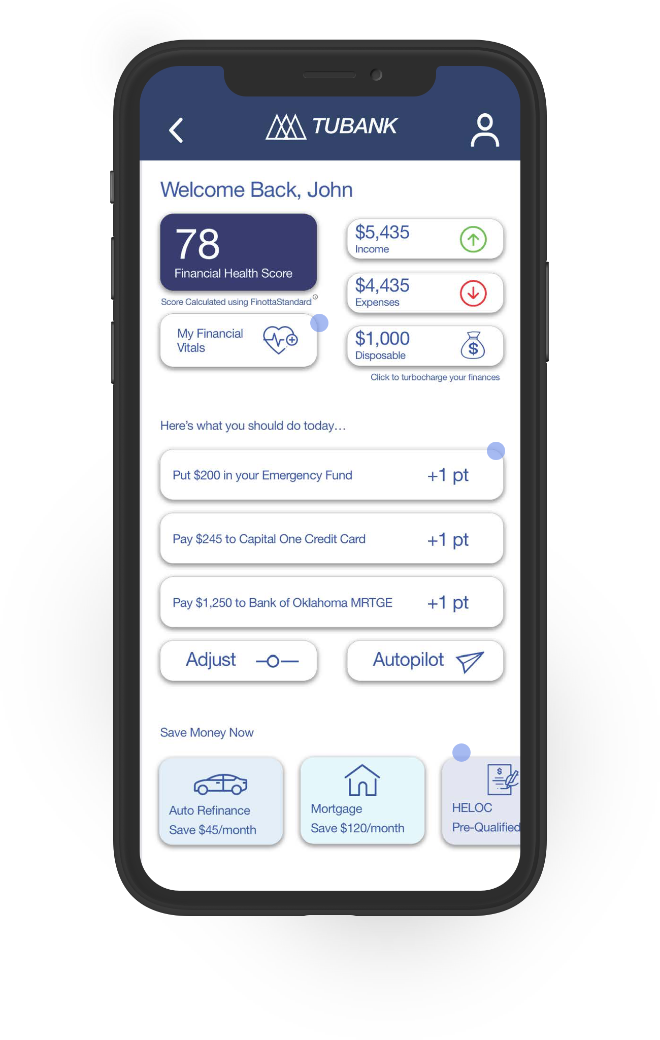
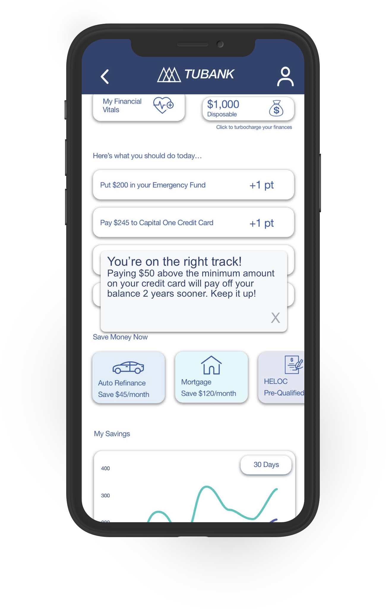
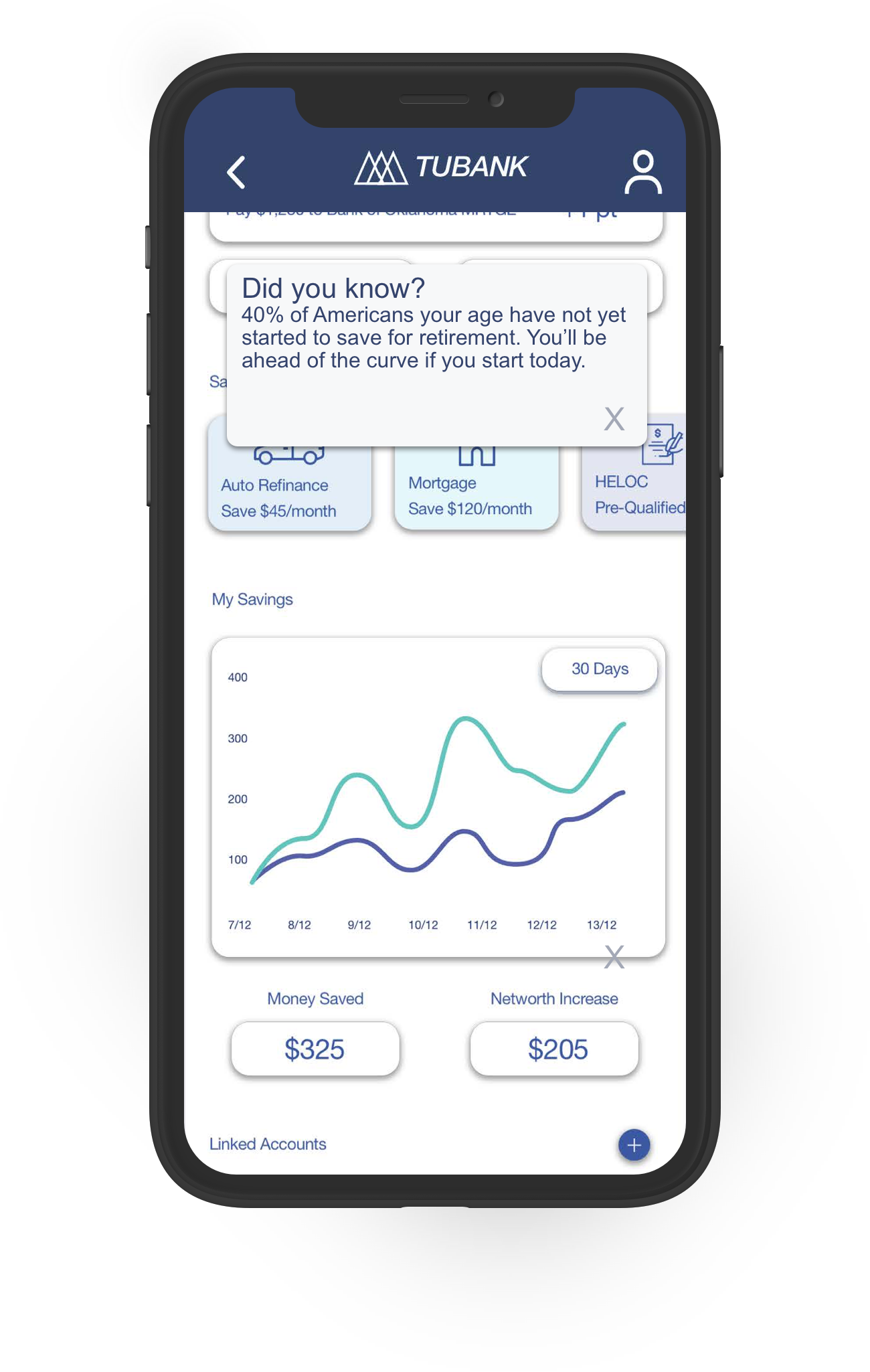
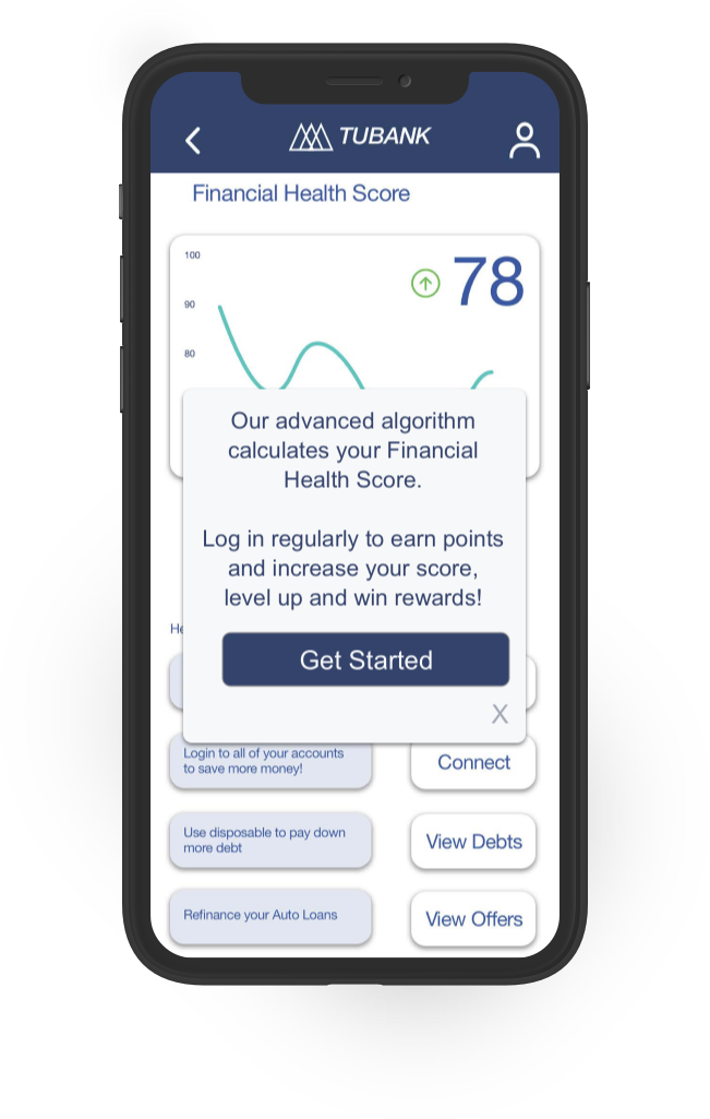
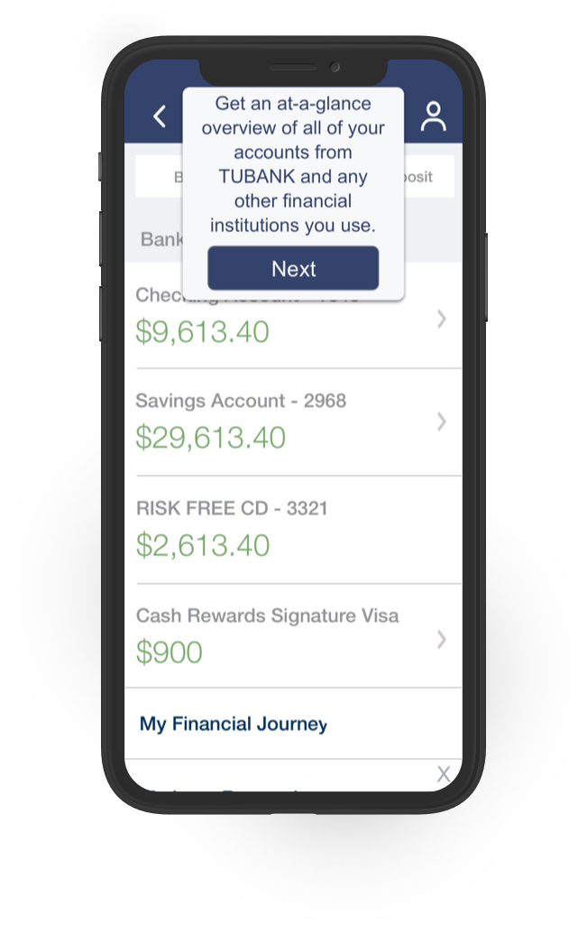
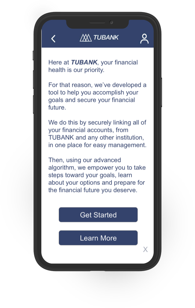
With the 100 hours of development time, I prioritized building 6 new features: adding an introductory feature walkthrough of the app to build engagement during the awareness phase of the user, a more thorough tour of the platform to be viewed during the onboarding process, encouraging messages and statistics pop-ups to boost user confidence, a leveling system to the Finotta Financial Health Score, celebratory animations as users level-up in the app, and a system of definition and explanation pop-ups to help users understand financial terms. Additional features were also proposed without wireframes, including a guided onboarding flow and users avatars. View the full report with annotated wireframes here.


Project Outcome
Through stated goals, research and interviews it was determined that the most valued features to add to the Finotta app would increase the gamification of the platform as well as make the process of navigating a user’s financial profile less intimidating and more engaging. Therefore, to give the Financial Health Score context for the user, I developed a leveling system with animations that appear when a user reaches consecutive levels in the app. Possible additional options for creating user avatars are also suggested. Toward the goal of increasing engagement during onboarding, I suggested introductions and tour designs. I also leveraged micro-interactions for encouragement and support of behavior through educational pop-ups.
“I think this is spot-on in terms of reducing the anxiety and letting the user know it's OK to be in the place they're at.”
— Finotta feature review

